A case study on designing and developing a film-inspired photography portfolio website with Jekyll and Tailwind CSS.
Project Overview
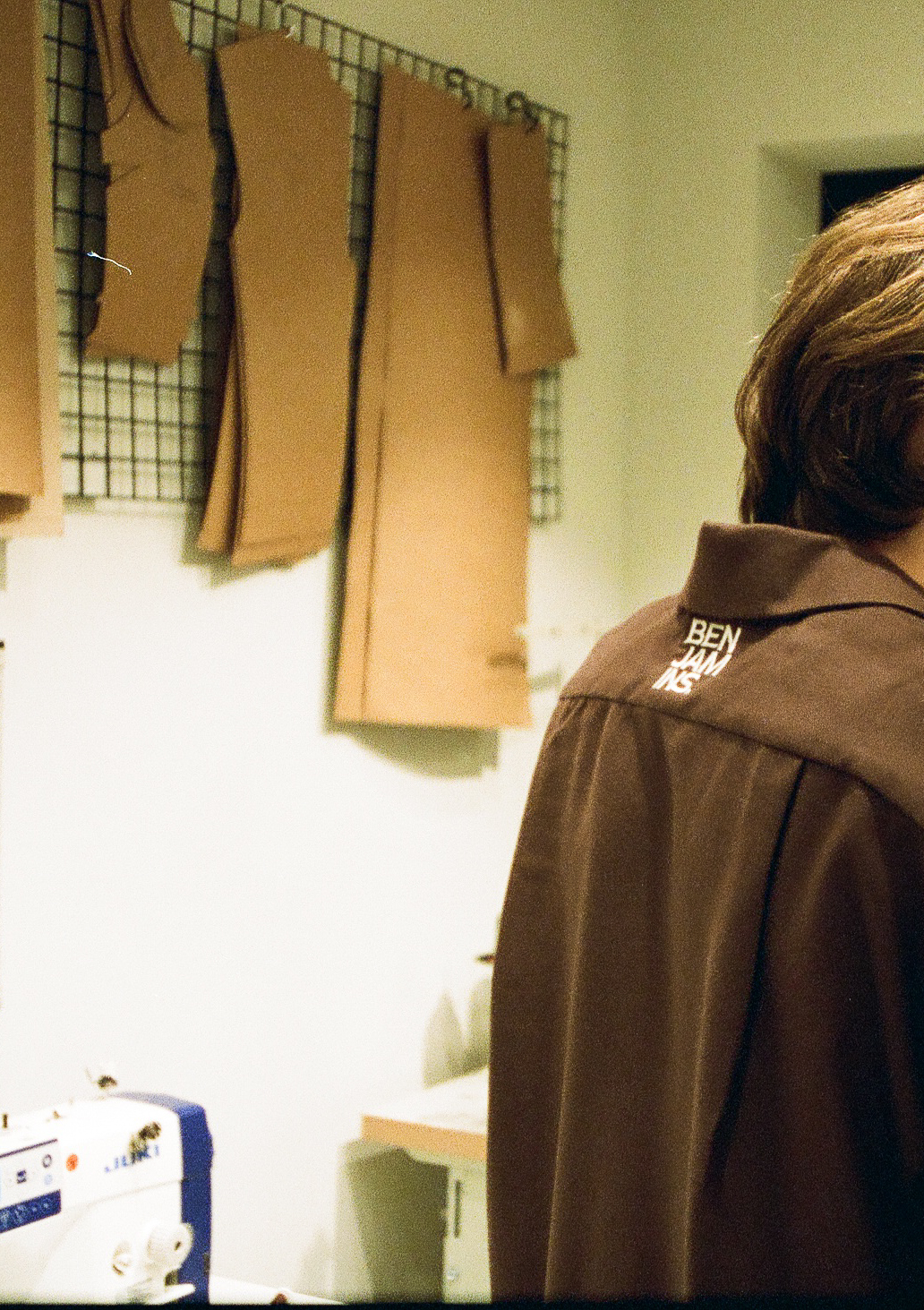
Benjamin’s Photography needed a portfolio website that would showcase their film photography work while also evoking the nostalgic feel of analog film. The goal was to create a digital experience that felt tactile and reminiscent of physical film while maintaining modern web standards and performance.
Challenge
The main challenges for this project were:
- Creating digital design elements that authentically captured the aesthetic of analog film
- Building a responsive gallery that maintained the film-inspired look across all devices
- Ensuring fast loading times despite the image-heavy nature of a photography portfolio
- Implementing a content management system that would be easy for the client to update
Solution
Design Approach
We took inspiration from physical film elements such as:
- Film borders and sprocket holes
- Subtle film grain textures
- Vignetting effects
- Color palettes inspired by popular film stocks
These elements were implemented using a combination of Tailwind CSS utilities and custom CSS components. We created reusable film-inspired UI components that could be applied throughout the site.
Technical Implementation
The website was built using Jekyll as the static site generator, which provided several advantages:
- Fast loading times due to static HTML generation
- Simple content management through Markdown files
- Built-in support for collections, perfect for organizing photography projects
- Easy deployment to any hosting platform
Tailwind CSS v4 was used for styling, allowing for rapid development and consistent design implementation. We created custom utilities for film-inspired effects that could be applied to any element.
HTMX was implemented for the gallery lightbox functionality, providing a smooth user experience without heavy JavaScript frameworks. This approach kept the site lightweight while still offering interactive features.
Performance Optimization
To ensure fast loading times despite the image-heavy nature of the site, we implemented:
- Responsive images with appropriate srcset attributes
- Lazy loading for off-screen images
- Image optimization pipeline using Jekyll Assets
- Critical CSS loading for above-the-fold content
Results
The final website successfully captured the film aesthetic while maintaining excellent performance metrics:
- 95+ Google Lighthouse score for performance
- Fully responsive design that works across all devices
- Intuitive navigation and content organization
- Easy content management for the client
The client reported a significant increase in engagement, with visitors spending an average of 3.5 minutes on the site (up from 1.2 minutes on their previous site).
Conclusion
This project demonstrates how digital design can effectively evoke analog aesthetics while maintaining modern web standards. By carefully balancing nostalgic design elements with performance optimization, we created a unique photography portfolio that stands out in the digital landscape.
The film-inspired design elements have become a signature style for the client, helping to differentiate their brand in a crowded photography market.